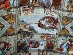
Sistine Chapel Ceiling, by Michelangelo
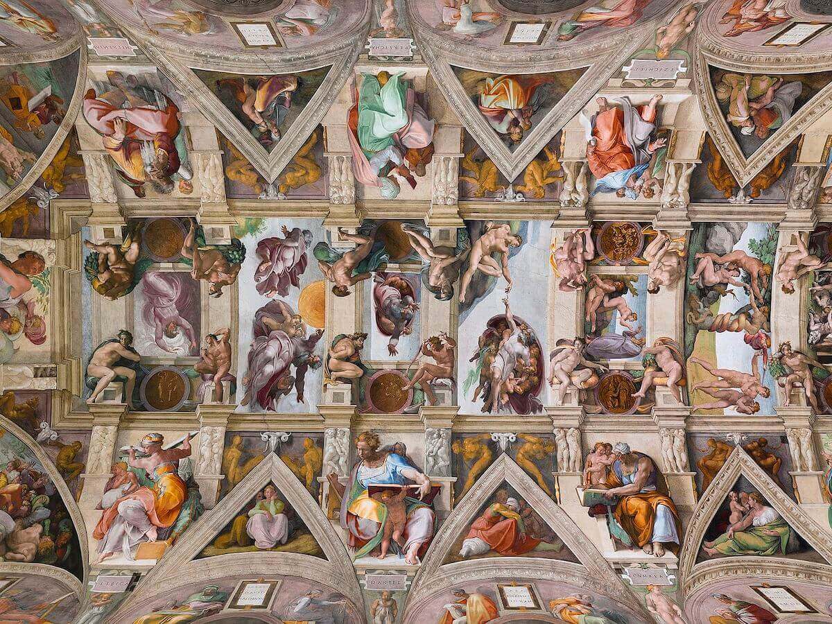
When Michelangelo actually started painting the Sistine Chapel Ceiling at the east end, probably in the early months of 1509, the implications of the structure had not been entirely established in his mind. The first section still contains sharp discrepancies in scale between the large figures outside the central scenes and the smaller figures that crowd within them. Furthermore, there is at the start little sense of unity of design among the various components of the entire structure. As he proceeded, however, he was able to integrate the elements so closely, and move the observer's eye from one to the other so logically, that in the west end, above the altar, one scarcely notices that he retained several incompatible scales - one for the prophets and sibyls, another for the seated nudes, a third for the bronze-colored nudes, and a fourth for the scenes in the central rectangles and the corner spandrels.
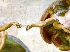
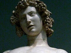
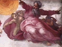
Unity is accomplished partly by increasing the scale from the seated nudes to the figures in the scenes, rather than diminishing it as in the first portion of the Ceiling, where the central scenes, especially, look a little weak from the floor. Even more important, however, Michelangelo was extremely careful to continue diagonal motions from one scene to the next or from the scenes to the nudes, across all intervening barriers. The diagonal movement of the wall separating the two central incidents in the Haman scene, for example, is continued in the bend of the legs of the Creator in the Separation of Light from Darkness and the position of His head in the Creation of Sun, Moon, and Plants. Similarly the diagonal of Moses' rod in the Brazen Serpent is prolonged in the back of the nude left above Libyca and the raised right leg of the diagonally opposite nude, left above Jeremiah. In fact, these diagonal movements are still reflected in the legs and backs of all four nudes in the next bay. Each group of four nudes, moreover, surrounds one of the smaller scenes so that some of its forms converge on the scene in the shape of a huge "X," while others move about it diagonally, giving the square group the suggestion of an octagonal frame of living limbs. All of the last five prophets and sibyls are so richly integrated with their surrounding elements in this manner that it is artificial to detach them, as one must for the purposes of a book, and see them separately. Michelangelo intended all the forces to work together, like those in the flying buttresses, transverse, diagonal, and wall ribs that support the vault of a Gothic cathedral. Figures, scenes, architecture, and decoration have become an indissoluble unity.
Color throughout is calculated to enhance the total sense of structure. While the Ceiling is dominated by the soft gray and whitish tones of the simulated marble and the gray-blue of the sky,
it is punctuated by sharper accents of sometimes extremely vivid color, chiefly the bright garments of the prophets and sibyls and the figures in the corner spandrels, but also the warm flesh
colors of the nudes, sometimes pale, sometimes deeply tanned, the brownish bronze of the medallions, the gold-bronze of the nudes between the thrones, and the soft lilac of their background,
echoed in the lilac and gray-violet tones in the Lord's mantle.
Throughout the entire Ceiling, among all the figures which are imagined to exist in the actual space of the room outside the frames - the seated nudes, the prophets and sibyls, and their
attendant figures - the lighting is unified. It comes not from the windows of the Chapel, as would have been customary in the illusionistic wall paintings of the fifteenth century, but from
the direction of the altar, toward which, in the vast, celestial world of the Ceiling, all forms and forces, symbols and events, are directed.
